WPF DataGrid using MahApps.Metro
MahApps.Metro ships two cool styles to beautify the DataGrid control that ships with .NET 4.0 by default. With this styling you can use filtering, grouping, sorting and other standard features that you would expect of a DataGrid. It also contains a DataGridCheckBoxColumn style as well as a custom DataGridNumericUpDownColumn style.
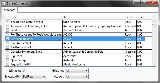
So for showing the differences, here is the default look:
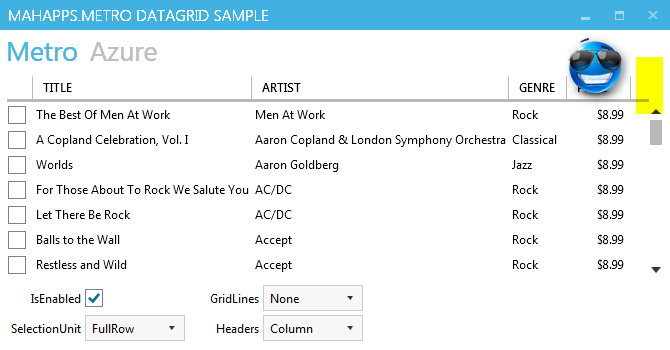
Now, if you use the MahApps.Metro style for the application, you get this result:
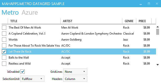
Looks awesome!
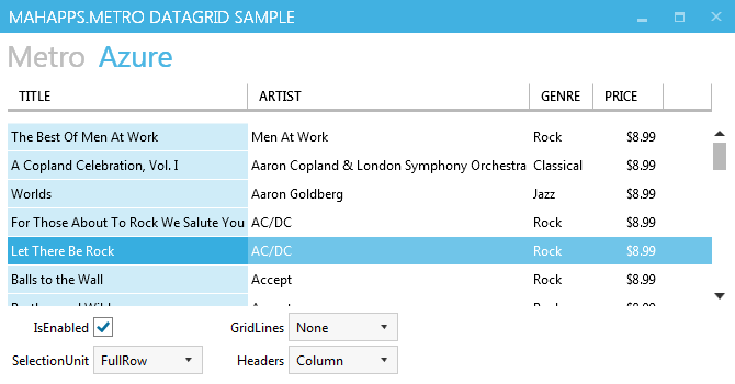
There is another style called Azure which can be used by
1
<DataGrid Style="{DynamicResource AzureDataGrid}" />
Removing the right gripper
There is an issue with the style, that can be very confused. The DataGrid has a right gripper at the column header without any functionality.
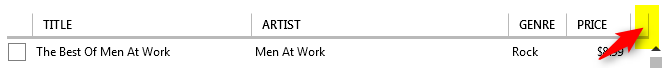
So how can it be removed? It’s only possible to override the DataGridColumnHeadersPresenter globally.
1
2
3
4
5
6
7
8
9
10
11
12
13
14
15
16
17
18
19
20
21
22
23
24
25
26
27
28
29
30
31
32
33
34
<!-- for ne metro style -->
<Style TargetType="{x:Type DataGridColumnHeadersPresenter}">
    <Setter Property="Template">
        <Setter.Value>
            <ControlTemplate TargetType="DataGridColumnHeadersPresenter">
                <Grid>
                    <Border IsHitTestVisible="False"
                            BorderThickness="0 0 0 3"
                            Background="Transparent"
                            BorderBrush="{DynamicResource GrayBrush5}" />
                    <ItemsPresenter />
                </Grid>
            </ControlTemplate>
        </Setter.Value>
    </Setter>
</Style>

<!-- for the azure style -->
<Style TargetType="{x:Type DataGridColumnHeadersPresenter}">
    <Setter Property="Template">
        <Setter.Value>
            <ControlTemplate TargetType="DataGridColumnHeadersPresenter">
                <Grid>
                    <Border IsHitTestVisible="False"
                            Margin="0 0 0 10"
                            BorderThickness="0 0 0 3"
                            Background="Transparent"
                            BorderBrush="{DynamicResource GrayBrush5}" />
                    <ItemsPresenter />
                </Grid>
            </ControlTemplate>
        </Setter.Value>
    </Setter>
</Style>
A complete example can be found on GitHub.