Tile banner for Chocolatey GUI
Since one week I’m contributing some thoughts to the Chocolatey GUI which is a nice tool for the chocolatey package manager for Windows.
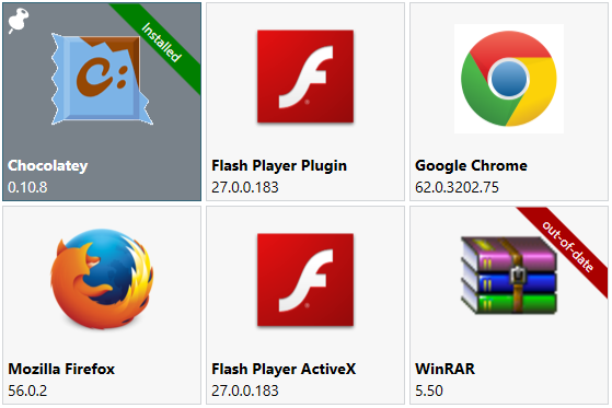
We are currently implementing a tile UI for the package view. Read and look at the changes in this PR.
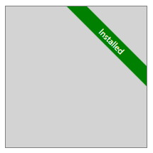
We decided to show a installed and out-of-date status as an overlay banner for every tile. My first thought was to create a SVG with inkscape and use the data for a path. But I came up with an easier version which is also nice to use.
I played a little bit with Kaxaml and found a way to use a RenderTransform and LayoutTransform with an Rectangle and TextBlock to get what I want.
1
2
3
4
5
6
7
8
9
10
11
12
13
14
15
16
17
18
19
20
21
22
23
24
25
26
27
28
<Border
    Width="200"
    Height="200"
    HorizontalAlignment="Center"
    VerticalAlignment="Center"
    Background="LightGray"
    BorderBrush="Gray"
    BorderThickness="1">
    <Grid ClipToBounds="True">
        <Grid Width="200" Height="20">
            <Grid.RenderTransform>
                <TranslateTransform X="50" Y="-50"/>
            </Grid.RenderTransform>
            <Grid.LayoutTransform>
                <TransformGroup>
                    <RotateTransform Angle="45"/>
                </TransformGroup>
            </Grid.LayoutTransform>
            <Rectangle Fill="Green"/>
            <TextBlock
                HorizontalAlignment="Center"
                VerticalAlignment="Center"
                Foreground="White"
                Text="Installed"
                TextAlignment="Center"/>
        </Grid>
    </Grid>
</Border>
As I said before, we need 2 versions for this, so I used it as a template for a ContentControl.
1
2
3
4
5
6
7
8
9
10
11
12
13
14
15
16
17
18
19
20
<ControlTemplate x:Key="OverlayTemplate" TargetType="ContentControl">
    <Grid ClipToBounds="True">
        <Grid Height="20" Width="200">
            <Grid.RenderTransform>
                <TranslateTransform X="55" Y="-55" />
            </Grid.RenderTransform>
            <Grid.LayoutTransform>
                <TransformGroup>
                    <RotateTransform Angle="45" />
                </TransformGroup>
            </Grid.LayoutTransform>
            <Rectangle Fill="{TemplateBinding Background}" />
            <TextBlock Text="{TemplateBinding Content}"
                       HorizontalAlignment="Center"
                       VerticalAlignment="Center"
                       TextAlignment="Center"
                       Foreground="{TemplateBinding Foreground}" />
        </Grid>
    </Grid>
</ControlTemplate>
Now we can use it more then one times.
For the installed status
1
2
3
4
5
6
7
8
<ContentControl x:Name="IsInstalledOverlay"
                ClipToBounds="True"
                IsTabStop="False"
                Focusable="False"
                Content="Installed"
                Background="#007F00"
                Foreground="White"
                Template="{StaticResource OverlayTemplate}" />
and out-of-date status
1
2
3
4
5
6
7
8
<ContentControl x:Name="OutOfDateOverlay"
                ClipToBounds="True"
                IsTabStop="False"
                Focusable="False"
                Content="out-of-date"
                Background="#A90000"
                Foreground="White"
                Template="{StaticResource OverlayTemplate}" />
Happy coding!

