Since v1.4.0 of MahApps.Metro contains now a HamburgerMenu control which is mostly the same as the one from the UWP Community Toolkit. So it should work in most cases like this, only the UWP specific part doesn’t work or has similar functionality. Take a look at the official documentation for the UWP control to learn more about.
In this blog post I’ll show you how it works in MahApps.Metro.
The HamburgerMenu is a ContentControl with an item list, an option item list on the left side and the content presenter on the right side. There are also some helper classes which makes it easier to work with the item lists: HamburgerMenuItem, HamburgerMenuGlyphItem and HamburgerMenuImageItem.
For this sample you need only these steps
- Add the
HamburgerMenu to the main layout root in your window.
1
2
3
4
5
6
| <controls:HamburgerMenu x:Name="HamburgerMenuControl"
Foreground="White"
PaneBackground="#FF444444"
IsPaneOpen="False"
DisplayMode="CompactInline">
</controls:HamburgerMenu>
|
- Specify templates for the items and option items. In this sample I use the
HamburgerMenuGlyphItem helper class and the Segoe MDL2 Assets font family which is only available in windows 10. You can find other samples in this repository which uses the other helper classes too.
1
2
3
4
5
6
7
8
9
10
11
12
13
14
15
16
17
18
19
20
| <DataTemplate x:Key="MenuItemTemplate" DataType="{x:Type controls:HamburgerMenuGlyphItem}">
<Grid Height="48">
<Grid.ColumnDefinitions>
<ColumnDefinition Width="48" />
<ColumnDefinition />
</Grid.ColumnDefinitions>
<TextBlock Grid.Column="0"
FontSize="16"
HorizontalAlignment="Center"
VerticalAlignment="Center"
FontFamily="Segoe MDL2 Assets"
Foreground="White"
Text="{Binding Glyph}" />
<TextBlock Grid.Column="1"
VerticalAlignment="Center"
FontSize="16"
Foreground="White"
Text="{Binding Label}" />
</Grid>
</DataTemplate>
|
- Now set these templates to the
HamburgerMenu.
1
2
3
4
5
6
| <controls:HamburgerMenu x:Name="HamburgerMenuControl"
...
ItemTemplate="{StaticResource MenuItemTemplate}"
OptionsItemTemplate="{StaticResource MenuItemTemplate}"
...
DisplayMode="CompactInline">
|
- Add a template for the content of the
HamburgerMenu.
1
2
3
4
5
6
7
8
9
10
11
12
13
14
15
16
17
18
19
20
21
22
23
24
25
| <!-- Content -->
<controls:HamburgerMenu.ContentTemplate>
<DataTemplate DataType="{x:Type controls:HamburgerMenuItem}">
<Grid x:Name="TheContentGrid">
<Grid.RowDefinitions>
<RowDefinition Height="48" />
<RowDefinition />
</Grid.RowDefinitions>
<Border Grid.Row="0"
Background="#FF444444">
<TextBlock x:Name="Header"
HorizontalAlignment="Center"
VerticalAlignment="Center"
FontSize="24"
Foreground="White"
Text="{Binding Label}" />
</Border>
<ContentControl x:Name="TheContent"
Grid.Row="1"
Focusable="False"
Foreground="{DynamicResource BlackBrush}"
Content="{Binding Tag}" />
</Grid>
</DataTemplate>
</controls:HamburgerMenu.ContentTemplate>
|
- Add the items and option items.
1
2
3
4
5
6
7
8
9
10
11
12
13
14
15
16
17
18
19
20
21
22
23
24
25
26
27
28
29
30
31
32
33
| <!-- Items -->
<controls:HamburgerMenu.ItemsSource>
<controls:HamburgerMenuItemCollection>
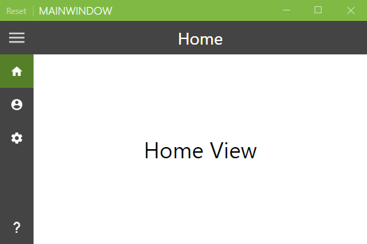
<controls:HamburgerMenuGlyphItem Glyph="" Label="Home">
<controls:HamburgerMenuGlyphItem.Tag>
<views:HomeView />
</controls:HamburgerMenuGlyphItem.Tag>
</controls:HamburgerMenuGlyphItem>
<controls:HamburgerMenuGlyphItem Glyph="" Label="Private">
<controls:HamburgerMenuGlyphItem.Tag>
<views:PrivateView />
</controls:HamburgerMenuGlyphItem.Tag>
</controls:HamburgerMenuGlyphItem>
<controls:HamburgerMenuGlyphItem Glyph="" Label="Settings">
<controls:HamburgerMenuGlyphItem.Tag>
<views:SettingsView />
</controls:HamburgerMenuGlyphItem.Tag>
</controls:HamburgerMenuGlyphItem>
</controls:HamburgerMenuItemCollection>
</controls:HamburgerMenu.ItemsSource>
<!-- Options -->
<controls:HamburgerMenu.OptionsItemsSource>
<controls:HamburgerMenuItemCollection>
<controls:HamburgerMenuGlyphItem Glyph="" Label="About">
<controls:HamburgerMenuGlyphItem.Tag>
<views:AboutView />
</controls:HamburgerMenuGlyphItem.Tag>
</controls:HamburgerMenuGlyphItem>
</controls:HamburgerMenuItemCollection>
</controls:HamburgerMenu.OptionsItemsSource>
|
- Set the content for the selected item / option item.
1
2
3
4
5
6
| <controls:HamburgerMenu x:Name="HamburgerMenuControl"
...
ItemClick="HamburgerMenuControl_OnItemClick"
OptionsItemClick="HamburgerMenuControl_OnItemClick"
...
DisplayMode="CompactInline">
|
1
2
3
4
5
6
7
| private void HamburgerMenuControl_OnItemClick(object sender, ItemClickEventArgs e)
{
// set the content
this.HamburgerMenuControl.Content = e.ClickedItem;
// close the pane
this.HamburgerMenuControl.IsPaneOpen = false;
}
|
More samples
You can find more samples in this repository with
- Sample from this blog post
- Sample with
Binding to the SelectedItem / SelectedOptionsItem - Sample with a custom helper class
HamburgerMenuIconItem which uses the MahApps.Metro.IconPacks - Sample with Caliburn.Micro (not yet added)
- Sample with some code behind