Collapse Row- or ColumnDefinition with GridUnitType.Star
Another short blog post about an issue which I found at the Chocolatey GUI repository. When I saw this issue, my first thought was, it’s an easy one to solve, but only at first sight.
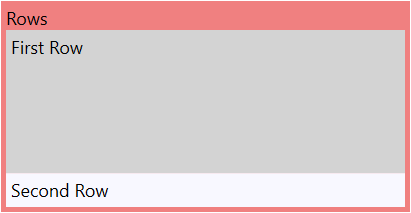
The GridLength for ColumnDefinition or RowDefinition can be GridUnitType.Star, which means it expands to the available space on the parent container or GridUnitType.Auto, which calculates the desired space of the inner child controls.
Here is a simple sample which demonstrates the usage of GridUnitType.Star and GridUnitType.Auto
1
2
3
4
5
6
7
8
9
10
11
12
13
14
15
16
17
<Grid>
<Grid.RowDefinitions>
<RowDefinition Height="Auto" />
<RowDefinition Height="*" />
<RowDefinition Height="Auto" />
</Grid.RowDefinitions>
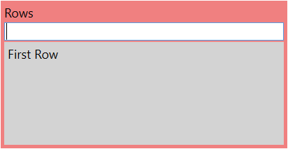
<TextBlock Grid.Row="0" Text="Rows" />
<Grid Grid.Row="1" Background="LightGray">
<TextBlock Padding="5" Text="First Row" />
</Grid>
<Grid Grid.Row="2" Background="GhostWhite">
<TextBlock Padding="5" Text="Second Row" />
</Grid>
</Grid>
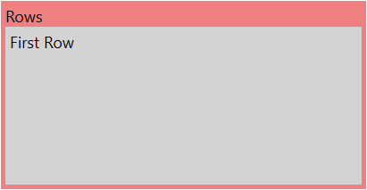
If the control on the row with GridUnitType.Auto will be collapsed then the complete row is gone.
1
2
3
4
5
6
7
8
9
10
11
12
13
14
15
16
17
<Grid>
    <Grid.RowDefinitions>
        <RowDefinition Height="Auto" />

        <RowDefinition Height="*" />
        <RowDefinition Height="Auto" />
    </Grid.RowDefinitions>

    <TextBlock Grid.Row="0" Text="Rows" />

    <Grid Grid.Row="1" Background="LightGray">
        <TextBlock Padding="5" Text="First Row" />
    </Grid>
    <Grid Grid.Row="2" Background="GhostWhite" Visibility="Collapsed">
        <TextBlock Padding="5" Text="Second Row" />
    </Grid>
</Grid>
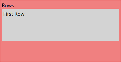
But what, if it’s necessary to use GridUnitType.Star for rows and columns and want to collapse it? Uups, they are not collapsed, they still shown with the given value and space.
1
2
3
4
5
6
7
8
9
10
11
12
13
14
15
16
17
<Grid>
    <Grid.RowDefinitions>
        <RowDefinition Height="Auto" />

        <RowDefinition Height="5*" />
        <RowDefinition Height="3*" />
    </Grid.RowDefinitions>

    <TextBlock Grid.Row="0" Text="Rows" />

    <Grid Grid.Row="1" Background="LightGray">
        <TextBlock Padding="5" Text="First Row" />
    </Grid>
    <Grid Grid.Row="2" Background="GhostWhite" Visibility="Collapsed">
        <TextBlock Padding="5" Text="Second Row" />
    </Grid>
</Grid>
To solve this, we can use a value converter which gives us the right result for the GridLength. The input in this case are the package release notes which can be empty. We need then Auto if it’s empty and 3* if not.
The value converter is quite simple.
1
2
3
4
5
6
7
8
9
10
11
12
13
14
15
16
17
18
19
20
21
22
23
24
25
26
27
public class NullToValue : IValueConverter
{
    /// <summary>
    /// This result will be used if the input value is null or a white space string.
    /// </summary>
    public object TrueResult { get; set; }

    /// <summary>
    /// This result will be used if the input value is not null and no a white space string.
    /// </summary>
    public object FalseResult { get; set; }

    public object Convert(object value, Type targetType, object parameter, CultureInfo culture)
    {
        if (value == null || (value is string && string.IsNullOrWhiteSpace((string)value)))
        {
            return TrueResult;
        }

        return FalseResult;
    }

    public object ConvertBack(object value, Type targetType, object parameter, CultureInfo culture)
    {
        throw new NotImplementedException();
    }
}
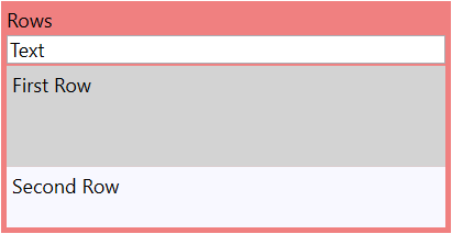
You need now 2 variations to solve our problem, one converter for the row height and one for the inner control visibility.
1
2
3
4
5
6
7
8
9
10
11
12
13
14
15
16
17
18
19
20
21
22
23
24
25
26
27
28
29
30
31
32
33
<Grid>
    <Grid.Resources>
        <local:NullToValue x:Key="NullToValue"
                            FalseResult="3*"
                            TrueResult="Auto" />
        <local:NullToValue x:Key="NullToVisibility"
                            FalseResult="Visible"
                            TrueResult="Collapsed" />
    </Grid.Resources>
    <Grid.RowDefinitions>
        <RowDefinition Height="Auto" />
        <RowDefinition Height="Auto" />

        <RowDefinition Height="5*" />
        <RowDefinition Height="{Binding ElementName=TextInputEvent, Path=Text, Converter={StaticResource NullToValue}}" />
    </Grid.RowDefinitions>

    <TextBlock Grid.Row="0" Text="Rows" />

    <TextBox x:Name="TextInputEvent"
                Grid.Row="1"
                Margin="0 2"
                Text="Text" />

    <Grid Grid.Row="2" Background="LightGray">
        <TextBlock Padding="5" Text="First Row" />
    </Grid>
    <Grid Grid.Row="3"
            Background="GhostWhite"
            Visibility="{Binding ElementName=TextInputEvent, Path=Text, Converter={StaticResource NullToVisibility}}">
        <TextBlock Padding="5" Text="Second Row" />
    </Grid>
</Grid>
Happy coding!